

專案時程-Jan. ~ Feb. 2025
專案角色-Icon 設計、設計系統擴充
專案業主-Little Print
Project Background
專案背景
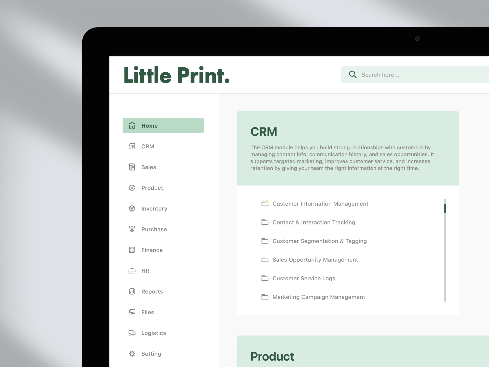
After completing the paper sample book design project for Melbourne-based printing company Little Print, I gained a deeper understanding of their brand identity. I then collaborated with the engineering team to develop an icon library specifically designed for their ERP system. Although I was unable to continue with the later stages of development due to returning to Taiwan, I completed the initial planning and structure of the icon set based on the existing brand guidelines. This system is expected to serve as a core element of the visual language across Little Print’s digital products.
完成與墨爾本印刷廠 Little Print 合作的紙樣書設計專案後,對品牌識別有了更全面的認識,隨即展開與工程團隊合作,建立一套專為 ERP 系統設計的 Icon Library。儘管因返臺未能參與後續開發,但已根據品牌識別體系進行延伸設計,完成圖標的初步規劃與架構,預計成為 Little Print 各項數位產品中視覺語言的重要基礎。
Create an Icon Guidelines
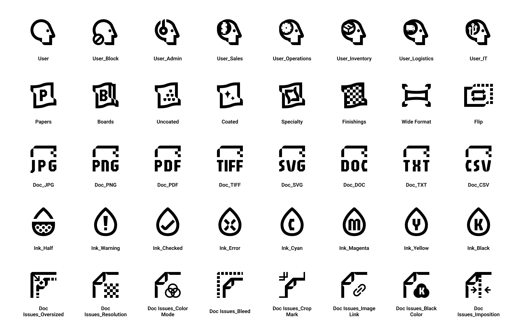
We moved forward with several team discussions to outline a clear direction for the icon design guidelines. Throughout the process, we grounded our approach in Little Print’s brand personality—simple, modern, and mature—as the foundation of our visual language.
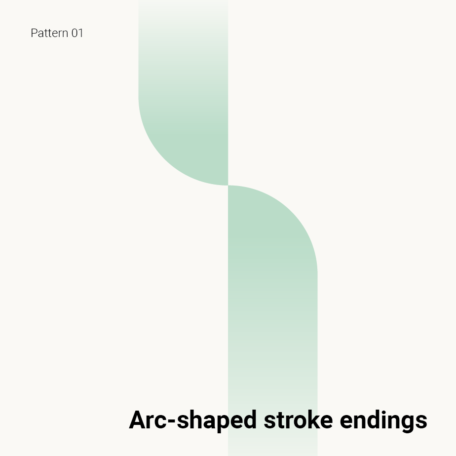
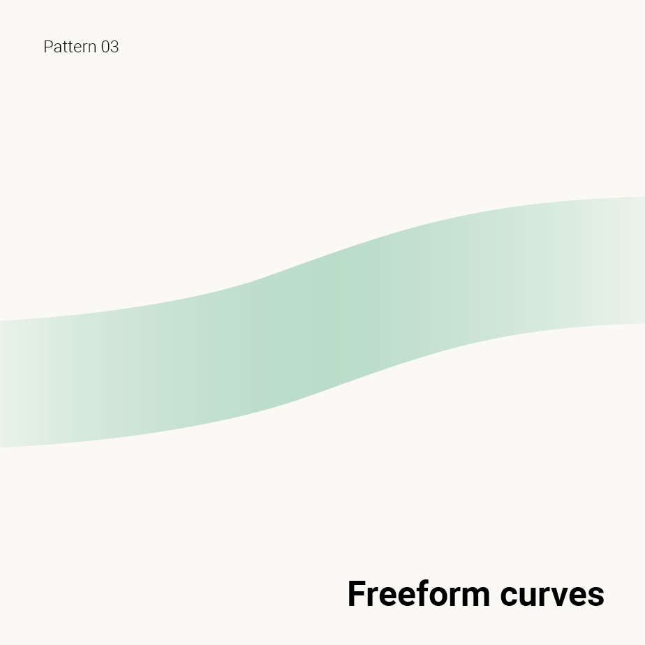
The icon system was developed with specific visual features in mind: stroke endings are arc-shaped, joints use miter corners, and freeform curves are applied throughout. These design choices helped shape a consistent and refined visual identity that aligns seamlessly with the overall brand aesthetic.
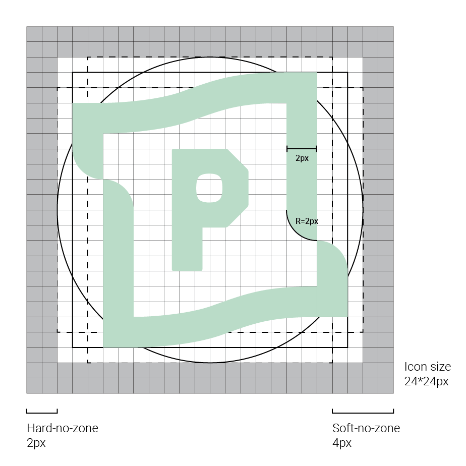


Usage Guidelines
To maintain visual consistency, avoid distorting icons by stretching, rotating, or changing their angle. Another frequent misuse is placing icons on dark backgrounds with insufficient contrast, which affects readability. Icons are available in both black and white—select the version that provides optimal contrast against the background. Clear, accessible presentation should always be the top priority.
Reflections & Learnings
反思與學習
When I joined this project, most of the foundational research and structure had already been established. I focused on extending the brand’s visual style and visualising functional requirements into icon designs. Through collaboration with the engineering team, I gained valuable insights into classification and naming practices that enhance the maintainability and scalability of the icon library. This project also reinforced my understanding that, for tool-based platforms, effective communication of functionality is essential for improving the user experience.
在我加入此專案時,大部分架構已初步完成,我的角色主要是延伸品牌風格,將所需功能具象為圖標。與工程團隊的協作過程中,學習到許多關於分類方式及命名規則的實用建議,讓 icon library 更具維護性與擴充性。此專案最大的收穫在於,對於工具型數位平台而言,圖標設計必須直觀傳達功能,才能有效提升使用者體驗。